Blood, Sweat and Tears

Everyone has their own blood story.
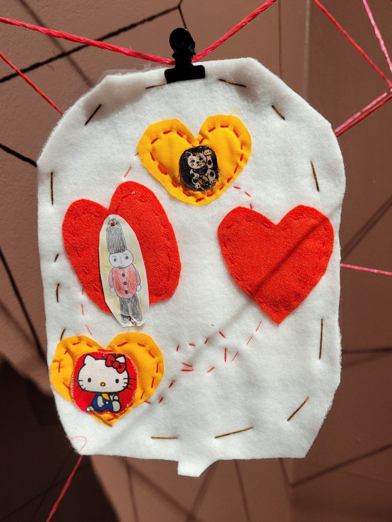
Made as part of artist Leigh Bowser’s Blood Bag Project, the fabric blood bags hanging in our Blood: Ties and Tensions exhibition have allowed people to share their stories, experiences and emotions around giving and receiving blood.
They were made by participants from the Korea Leukemia Patients Organization in Seoul, South Korea and students at Bukkyo University in Kyoto, Japan.
You can hear some of the voices of the people who made these bags talking about their experiences as part of the exhibition’s installation, Vessel.
Here you can discover the story behind each blood bag.

Made by a recovered leukaemia patient and composer.
The design represents the hands of people from all backgrounds: blue-collared workers, office workers, housewives, children, elderly, and a Korean independence fighter from the 1900s. The pink button represents breast cancer. The purple button represents all cancers.
“I used my nickname for my name and wrote my location as “home,” meaning I’m at home wherever I am now, thanks to you. Though I really do want to go home after being here for so many hours.”

Made by a recovered leukaemia patient.
The design represents deep gratitude for the people who saved her.
“I’ve never donated blood myself because the requirements are so strict: you can’t take any medication, or have given birth, among other things. I couldn’t meet those conditions, but my daughter, despite being young, saw her mom suffering and decided to take action by donating blood. When I saw her bruised all over from it, I felt so grateful and thankful. She said that once she heals, she’ll go donate again. I realized through my daughter how truly difficult it is to donate blood. When I received transfusions, I didn’t fully feel the gratitude, but after seeing her give blood to the point of bruising—still putting on a skin-colored tape and heading to her part-time job, saying it was fine—I felt this is no simple task.”

Made by the Director of the Korea Leukemia Patients Organization, An Gi-jong, and the Co-President, Eun-young Lee.
The design shows the logo of the KLPO with a heart representing life and blood as a connection between everything.

Made by the mother of a recovered leukaemia patient.
The design represents a character used by the hospital at an event for children with leukaemia.
“Since my child can’t go out easily, he talks to the sky, trees, passing cars and birds. Since it’s hard to make friends, he makes friends with things. So I made this character for him to have one more friend and laugh a little more.”

Designed by a recovered leukaemia patient and sewn by her husband.
The design represents the hands and feet that she lost due to leukaemia. The buttons represent the sun and moon with the red line symbolising blood. The green above the feet represents mountains and her desire to be healthy enough to go hiking.
“The sun and the moon rise together in the sky, but we only see the sun during the day and the moon at night. I wanted to always see the sun and the moon together, so I expressed them with buttons. The red line represents blood. I wish that clear blood always flows into me so I can be healthy.”

Made by a student at Bukkyo University.
“Smile.”

Made by a recovered leukaemia patient and two of her daughters, aged 6 and 8.
The rainbow of buttons represents hope. The children’s bags are drawn rather than sewn.

Made by students at Bukkyo University.
“Our love can make the bird fly.”

Made by a recovered leukaemia patient in honour of her children.
The design represents blood as a fresh apple with the names of the children above.

Made by a student at Bukkyo University.
The design represents happiness.

Made by a student at Bukkyo University.
The design represents peace and sharing.

Made by a recently hospitalised leukaemia patient.
The design represents the constellation Ursa Major and the moon using beads and buttons.
“When you’re in the hospital, you just look at the ceiling, longing to go outside, see the sunlight.”

Made by a boy who received 90 units of transfusion for leukaemia, his mother and his young adult sister who recruited blood donors during her brother’s treatment.
The boy’s design shows a pocket. The sister’s represents blood in a red ribbon and platelets in a yellow ribbon, showing how blood connects and builds up. The mother’s uses hearts to symbolise love and red for blood. The colour scheme references the French cartoon superhero Ladybug.
“There’s an animation called Ladybug. Do you know it? Ladybug fights for justice … I just wanted it to fly to my kids and protect them. That’s my thought. We used to watch it a lot when he was young. It’s about fighting for justice. Kids love it, so I thought it’s for children with paediatric cancer.”

Made by a recovered leukaemia patient.
The bag shows the patient’s band logo “無限”, meaning “No Limit”.
“I hope that people receiving these bags will also be able to receive blood without limits. I started the band after recovery.”

Made by a student at Bukkyo University.
The design represents global connection.
“May the world overflow with smiles.”
Find out more about the blood bags and the workshops in which they were made.
